

Rebranding for Latino Memphis
For many Latinos living in Memphis, Latino Memphis is the first step in their pursuit of a better life for themselves and their families. For others, we are the only place they can turn to for assistance with health, education, and other basic services.
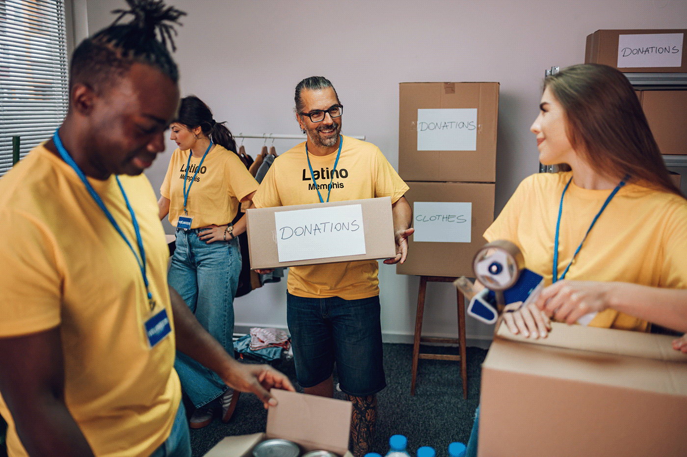
More and more Latinos are making Memphis their home every year. Over 80,000 Latino Memphians currently live, worship, work, study, and have fun here. As the primary provider of services to this community, we have dedicated ourselves to the idea that every Latino Memphian should have the opportunity and resources to become an engaged and active participant in making our city great. This means providing educational and career advancement opportunities, connecting clients to needed services, ensuring families are safe, and encouraging engagement between and among people of all backgrounds and ethnicities.
To accelerate systemic change by igniting opportunities that elevate the Latinx community through social, economic, political, education and health programs that in turn, advance and enrich Memphis and our nation as a whole.
Latino Memphis ignites, propels, and accelerates opportunities and upward social-economic-political-educational and well-being mobility for the Latinx community. Only when all community members move up will we achieve collective success. For over 20 years, Latino Memphis has become the go-to organization for issues impacting the Hispanic community in the MidSouth, raising the voice of Latinos in our region and advocating for a better, more inclusive Memphis.
The organization has been associated with the image of a "Butterfly," meaning transformation, that is, the life process that a butterfly goes through since it is a caterpillar until it metamorphoses into a butterfly. This meaning of transformation is directly linked to transforming people's lives through aid or donations so that they can grow personally and professionally. Therefore, butterflies are synonymous with perseverance and resilience, willing to go a long way to reach a goal.
The previous brand design was based on geometric elements combined to achieve the image of a butterfly. Although clean and structured, this concept can look very serious or corporate.
A new design was needed to refresh the company's image. The concept created for the new image maintains the butterfly reference but with a more human design, applying the illustration technique to have a closer and friendlier image of the butterfly. A composition made to connect from a more human and natural standpoint. At the same time, we made a change in typography that includes curves and gives a sense of fluidity and cleanliness.


The idea of making an illustration of a butterfly came from the need to increase connection with the logo. It has the impression of a drawing made by a child which connects with simplicity, humility, and most importantly, it connects with the target audience.
Finally, after several models with different colors, we produced this last model, in which we can see the use of colors in the butterfly to make it look brighter and cleaner.

The design was based on a vectorized illustration. The colors applied on the butterfly are those selected from the organization’s color palette. There is a more significant presence of yellow and orange because these colors represent joy and positivism.
At the same time, these colors can convey warmth and emotion, which is the most important message of Latino Memphis, to convey to the Latinx community that it is vital to continue with their cultural and professional development.

The main typeface is Harabara Mas, which has curved ends and straight lines. It should only be used to write or present the name Latino Memphis. It should not be used for any title or text context. It must always be in Bold format and without alterations of dimension or shape.
The secondary typeface is Avenir. It should be used for both digital and printed content. This typeface contains a wide variety of styles that can be used from Light to Heavy format. It should not be used with any dimension or shape alterations.


